Libby App Case Study
UI | Adobe XD | Photoshop
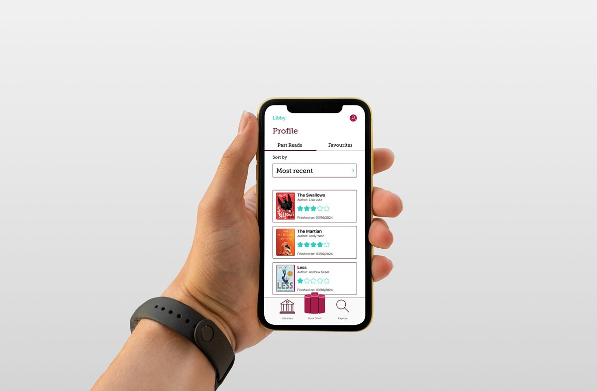
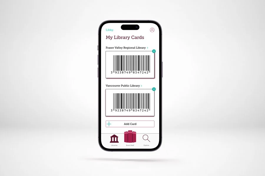
Libby is an app where people can rent eBooks, magazines, and audiobooks. The purpose of this project was to update the User Interface of the application while still keeping the same colours and typography. The significant changes to the application are the logo, buttons, layout, and organization. The changes are subtle, however, they create a magnitude of a difference when it comes to the users experience.
Hierarchy plays a crucial role in app design as it guides users through the interface, helps them understand the content, and facilitates smooth navigation. By establishing a clear hierarchy with text size and colour, I was able to better categorize and filter each page which results in an easier user flow.
User interface (UI) design holds numerous benefits for both users and developers alike. A well-crafted UI significantly enhances user experience by providing intuitive navigation, clear visual hierarchy, and engaging interactions, ultimately increasing user satisfaction and retention. Without being able to control the colour and typography, I really got to focus on layout and hierarchy. It was a fun challenge to not have creative freedom, rather, I was forced to think analytically to better understand the user flow of this application. Overall, prioritizing UI design results is a win-win scenario, where users enjoy a seamless experience and developers benefit from improved efficiency and market competitiveness. Now, get to reading!


