Phone Booth Speakeasy
Brand Identity | Merch Design | Package Design
Phone Booth is a fictional, allusive speakeasy based in a neighbourhood in Vancouver called Hastings-Sunrise. The goal of this project was to create strong brand identity while keeping the secrecy and allure of a hidden cocktail bar.
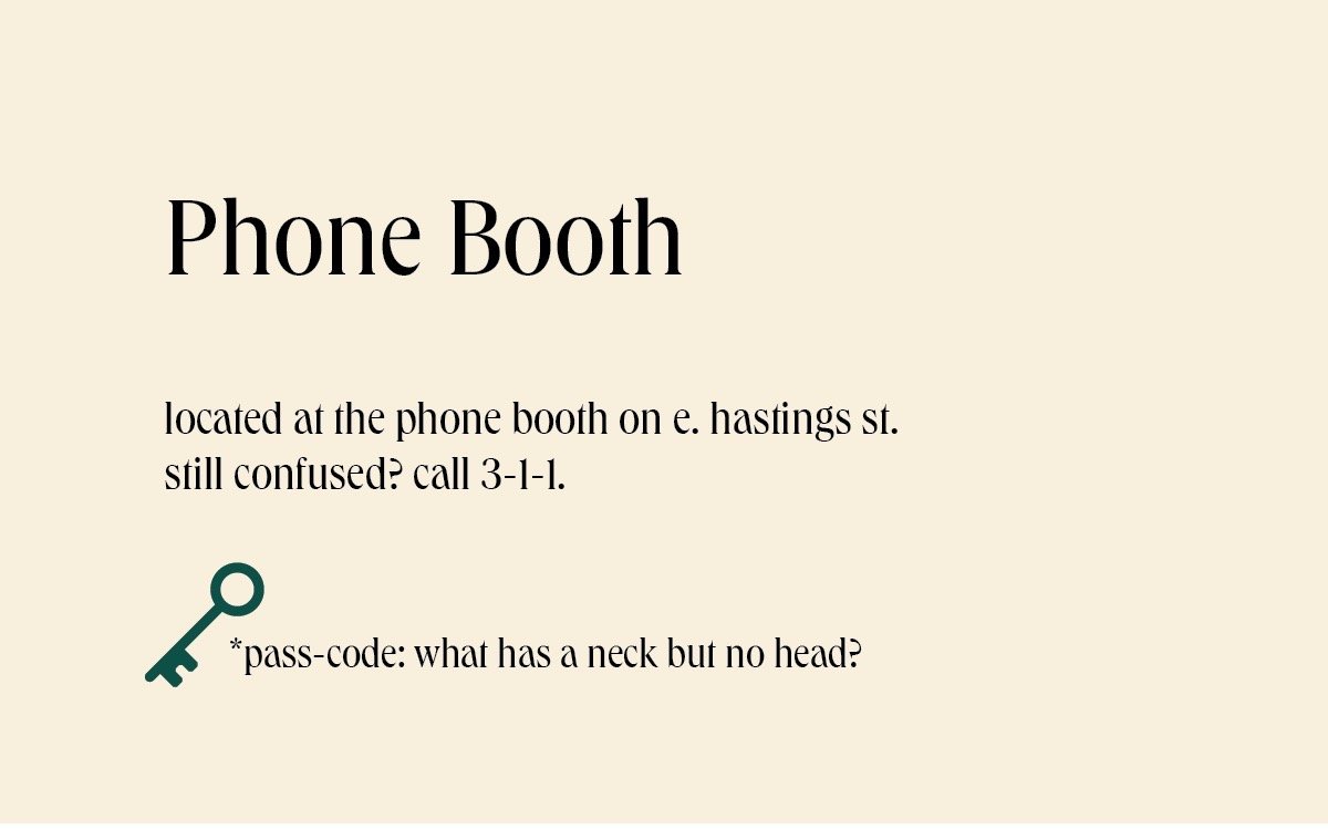
And now, a bit of history. These underground venues operated discreetly, often hidden behind unassuming facades or accessed through secret entrances, hence the name "speakeasy" to signify the need to speak quietly about such places. A person wanting to dine at this speakeasy in particular must use the payphone in front to contact an employee within and provide the correct password. How fun!
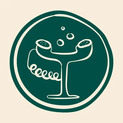
Above is Phone Booth’s logo mark. Enclosed in an ‘olive’ (I’m talking about the salty snack, not the colour) circle, is a combination of an old-style telephone headset and a cocktail glass. I wanted the logo to evoke a sense of mystery, balance, and quirkiness. That’s why I went with more of an illustrative approach as opposed to having perfect shapes and lines, because if we’re being honest, Hastings-Sunrise is far more charming than being strict and straight edged. The life, community, and locals is what makes it great.
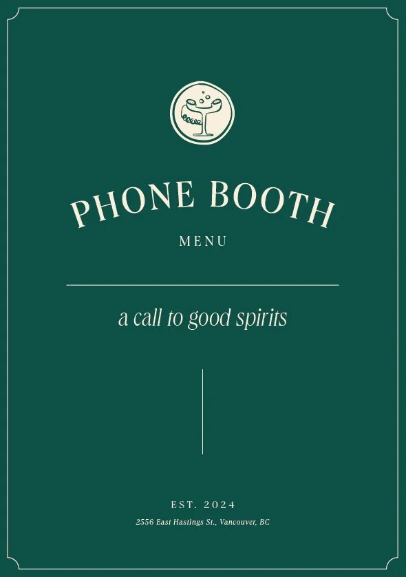
The secret to an up-and-coming speakeasy is a curated, cocktail menu. For this project, Phone Booth provides only organic and locally sourced products, buying from local sellers and distributors of BC wineries and distilleries. The quality of the ingredients are reflected in the elegance of the design.
A flask, a box of matches, and a deck of cards? That could be the start of a great murder-mystery novel. Or in this case, the type of merchandise you’d leave with at Phone Booth. Each item is related to the theme of the project, and attempts to bring people back in time to the roaring 20’s. No, not in this century.
All of this talk of cocktails really got me thirsty. Thirsty for package and product design. A subsection of this project was to create brand architecture. Here, I’ve created a line of signature cocktail mixers in which people can bring home and add their favourite type of spirit, or, for the sober-curious, they can just add tonic water and still enjoy the all natural goodness of the product.
Stationary with a purpose. Most, if not all, restaurants still do correspondence through paper mail. Why settle for a plain piece of white paper when the branding does the work for you? This is where professionalism and creativity come together to form something memorable. Even someone receiving an invoice will be impressed.
I’m thrilled with how this project turned out. My design process started with research of the neighbourhood, the people, local competition, and plenty of sketches. One of my strategies was establishing a target audience; in this case, I chose to target young professionals and students in the area. The more secretive a place is, the more it becomes exclusive and therefore, people want to experience it for themselves.
Everything from the colours, type, shapes, and illustrations can all be tied back to the initial research. Understanding the people of Sunrise-Hastings, and connecting elements of the neighbourhood made the design process plenty more meaningful. A highlight of this project was being able to tell a story through my designs, focusing on community, quality food, and togetherness.


